
Thursday 20 December 2012
ANCILLARY WORK: Research on the back of CD


Olly Murs
From looking at this digipak it is evident there is a clear colour scheme. Although the front panel does not have a close up there is one on the back panel.The album title is spread across two of the panels. You can also see that there are only two fonts used.
Another idea I had from looking at his particular one was having the artist on the front wearing an opposite colour of clothing compared to the colours used for the digipak.

Another idea I had from looking at his particular one was having the artist on the front wearing an opposite colour of clothing compared to the colours used for the digipak.


Wednesday 19 December 2012
Tuesday 18 December 2012
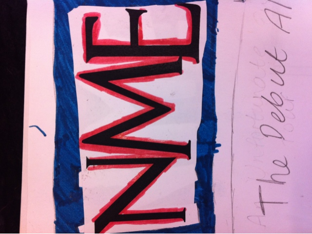
MUSIC VIDEO DEBUT: screen on the green
BEFORE: Today's the day! After many early mornings and late nights, we've finally reached the point where we prove it was all worth it and show it to the rest of the A2. Nervous. Excited. Proud. And hoping that we did enough to make it appeal to our audience and follow the conventions!

AFTER: Well that went well! Our video was well received and from the audience feedback, seemed to appeal to their expectations of a pop video. Relieved. Still Excited. Tired. And acknowledging that the time and effort was worth it.
FINAL MUSIC VIDEO LINK
Cinema screening !!!!
Today I went to go and watch our music video at the cinema it was really great to see everyone's hard work pay off ! Well done to everyone :)

Research : Adverts

On my way to the cinema i saw these in the tube station , which is where you usually find most of the adverts because a lot of people travel on the tube , i particularly like Brno Mars' advert as it simple and very clear. Ellie Gouldings advert also stuck out as it was big showing a close up of her face even though her eyes were shut , i liked the colour scheme black and pink they go in really well together it makes the writing stand out even more , if i was to use this i would make sure my colours compliment one another. Ed Sheeran's advert also caught my eye due to the right colour and at the bottom it says 'deluxe edition' which tells the audience what it is that will exactly be buying
Monday 17 December 2012
ANCILLARY WORK: Digi example

 This is the first real hard copy example of a digipak that I have looked at. The placement on the inside is interesting and maintains the colour scheme and theme throughout. The promotional sticker on the front makes it look even more professional (because it is) so I might consider creating a promotional sticker of my own to include on my digipak.


ANCILLARY WORK: Mock Up of Digipak and Advert
This is the mock up of my Digipak and advert. I want to create a 6 panel Digipak and on the third panel, I'm going to put photo booth style pictures all over it.
I'm not going to include pictures on the back of the digi anymore as I feel it will be better to keep it simple.


I'm not going to include pictures on the back of the digi anymore as I feel it will be better to keep it simple.


ANCILLARY WORK: Advertisement
This is an example of an album ad and I would like my ad to be similar o this ad the layout is good
Magazine Advertisements
Although these three magazine advertisements aren't directly the same as our music genre they all gave me different ideas on how to make my own.
 |
| This advertisement has a particular colour scheme of black, yellow and white. By showing the album underneath it shows the similar colour scheme they followed creating a direct link. |
 |
| This album also sticks to a particular colour scheme. By looking at this particluar one I thought to include ratings from different reviews shown through the stars. |
 |
| These three albums showed to to alslo include how the album would be available (digital download or album copy) |


Sunday 16 December 2012
ANCILLARY WORK: Possible Album Name
It has occurred to me that usually an album is named after one of the artists songs and most commonly their first single. This has made me think that perhaps our album should be called "Do My Thing"
ANCILLARY WORK: approach for research
I have noticed that in the pop genre, it is rare that a Digipak is produced to accompany the debut album of a debut artist. This has made it difficult to look at the true conventions of a first time Digipak as opposed to one of an artist who is already very well known. Therefore I have decided it would be best for me to look at a new artists first album for the front of the Digipak and then look at actual digipaks to understand what to put inside it.


ANCILLARY WORK: album covers on my journey
 When I was at the train station, I spotte a poster of a few album covers from the genre that we are using and thought it would be a great starting point and form of inspiration
Subscribe to:
Posts (Atom)